Dear athletics aficionados,
The Lazy Scholar happily welcomes back Matthew Mugmon, a graduate student in music at Harvard. Last heard ruminating on some surprisingly suggestive baseball tunes, Mugmon returns today to tackle another side of sports fandom.
Somewhat recent research suggests that when we root for sports teams, we’re actually rooting for ourselves. It only makes sense, then, that we want our favorite players to wear uniforms and logos that reflect the way we see ourselves—modern (or classic), hip, attractive, and, of course, intimidating. If athletic apparel includes logo misfires or design miscalculations, then we might start to lose confidence in our own ability to win at life.
 This must be why an article from last November revealing the U.S. World Cup soccer jerseys still collects heated comments from insecure American patriots. “Gary” aptly observed that the diagonal stripe resembles a beauty pageant sash, and “Matthew N” went so far as to wish failure on the U.S. team: “This has to be a god damn joke. These kits are hideous. They are so bad that I really may consider hoping they lose just because of this ugly kit.”
As a lifelong fan of the Washington Capitals hockey team, I get where “Matthew N” is coming from. I admit that my team’s clunky outfit from the late ‘90s until 2007 (pictured below) made me feel slightly self-conscious rooting for them.

Team officials know that a uniform or logo shift can energize or deflate a fan base, so it’s no surprise that they’ve apparently devoted more resources to fashion refinements—and sometimes overhauls — than even many active fans may realize. Thankfully, we can relive our favorite teams’ cosmetic histories (and thus our own) through an array of digital archives.
My first stop had to be The Hockey Uniform Database, a comprehensive source for information about, and images of, National Hockey League team uniforms and how they’ve changed. There, I discovered that in their inaugural season (1974-75), the Caps fashion directors made a mistake worse than the later black, white, and gold atrocities: white pants with red shirts. (Unfortunately, this archive doesn’t include images of the white pants, but pictures elsewhere show that it was, in fact, a bad move. I guess no white after Labor Day really is a rule to live by.) To explore the database, I recommend tracing the tiny adjustments and the seismic shifts using a “flipbook” browsing technique. Just pick the first set of jerseys for your selected team (teams are on the left), and then click the right arrow until you reach a uniform combo you really hate.
The Basketball Logo Index from the Association for Professional Basketball Research doesn’t have entire uniforms (and it hasn’t been updated in a while). But it does allow you to easily compare logos from teams as they moved around, since it includes all the designs of a particular franchise on the same page. So when the Chicago Zephyrs became the Baltimore Bullets in 1963 (today, the Washington Wizards), we can detect a relationship between the letter styles and spacing in “Zephyrs” and “Bullets” and then appreciate the continuity. Or, we can just laugh at the Fort Wayne Pistons (now the Detroit Pistons) mascot, who seems to have been a giant metal clown.


Turning to football (of the American variety), the level of detail on The Helmet Project is especially striking, considering that most football teams’ logos haven’t noticeably changed over the years. A diehard fan can use this site as a starting point for a dissertation on football helmet art. Here’s the kind of thoroughness we’re dealing with: “Some sources
indicate that the Falcons wore a single white stripe on their black helmets during at least one preseason game in 1990; however, I have never seen a single photograph to confirm this, and I now strongly doubt that this is true.” Me too.
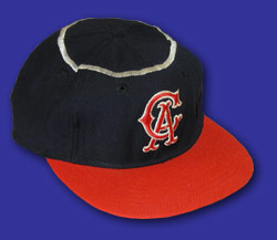 Finally, there’s the uniform database on Dressed to the Nines: A History of the Baseball Uniform, a searchable online exhibit from the Baseball Hall of Fame. As with football, headwear is the most interesting place on baseball uniforms for graphics. Unfortunately, the exhibit browser doesn’t let you zoom in on the hats, but among the special features here are discussions of the history of each part of the uniform, from caps to stockings. There, we find out that in the 1960s, the Angels hat had a silver halo on top (pictured). In 1971, that halo shrank and migrated to the “A” itself. Lucky for the Angels players, officials for Disney—which owned the team from 1996 to 2003—never managed to add Mickey Mouse ears to the design. But they probably thought about it.
Iconographically yours,
Matthew Mugmon


